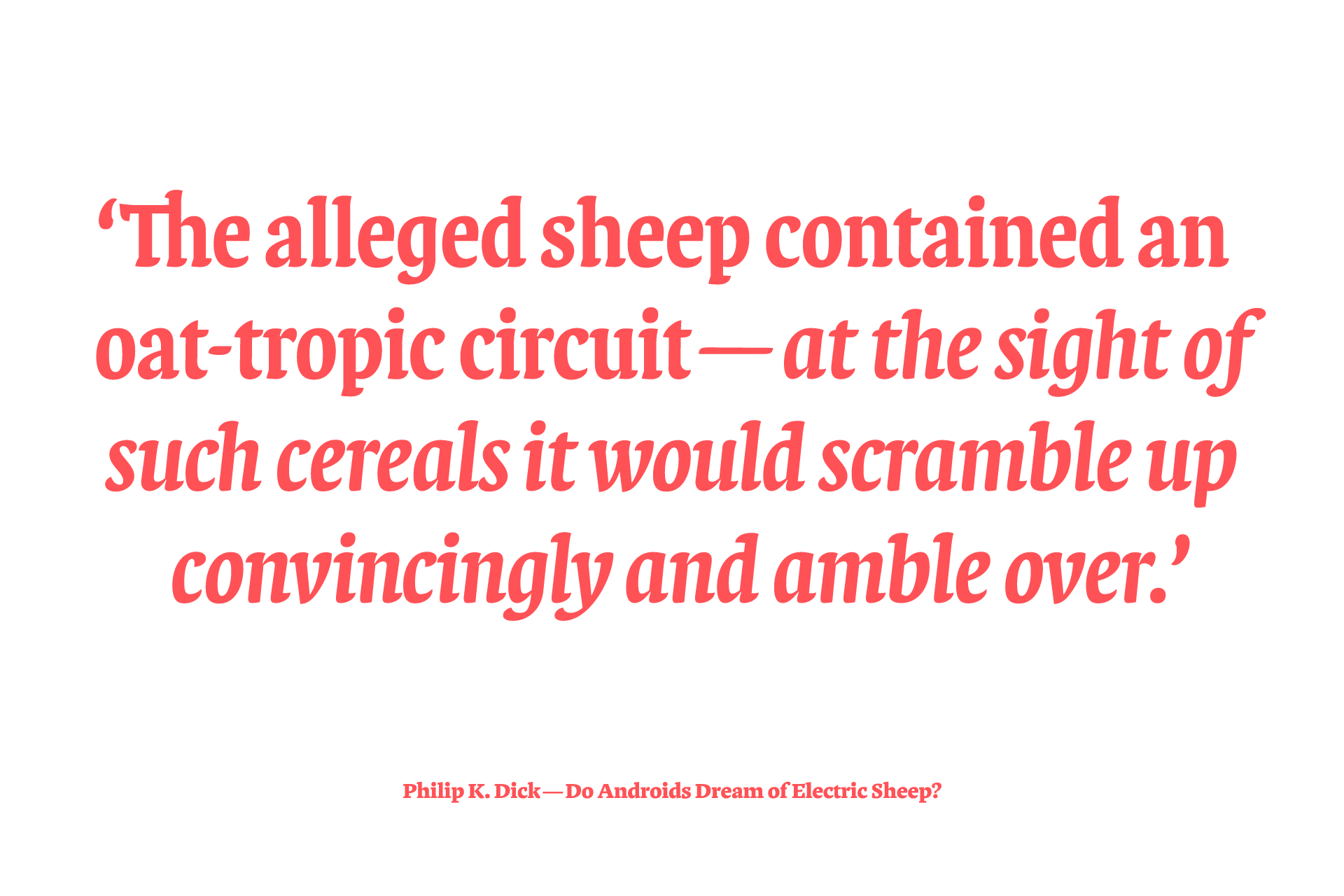
PINT
Serif typeface family inspired by humanist broad-nib calligraphy

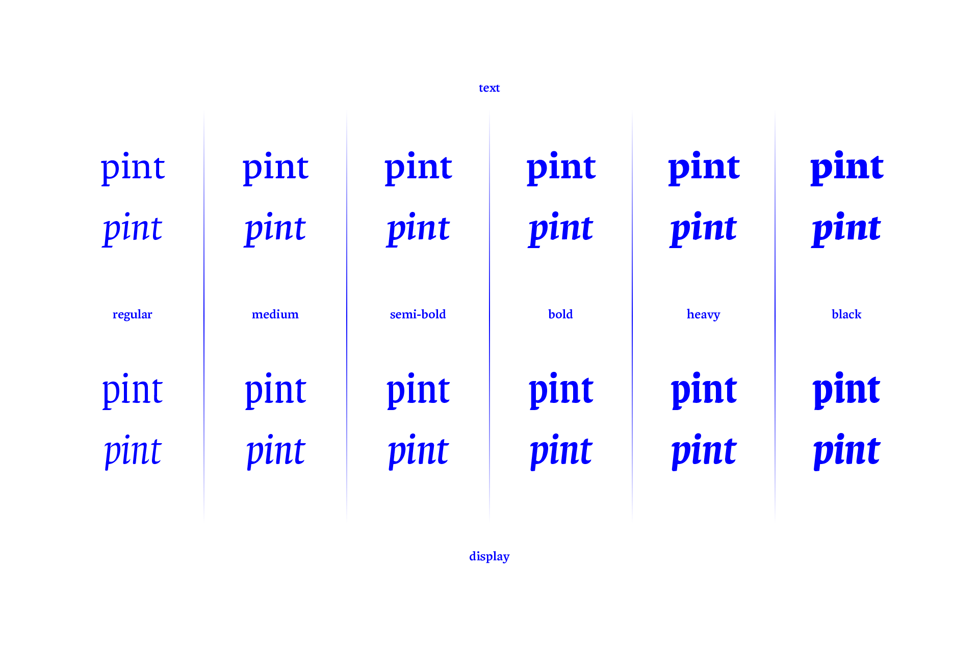
For text and display purposes
Pint explores the relation between a text typeface (used for longer texts like books or magazines) and its display counterpart (used for shorter texts like headings, covers, flyers and posters). As such it comes in two parts; its primary half was designed to set body copy at sizes between eight to sixteen points. The moderate contrast of these text styles provide for a clear and crisp texture with a more solid and sturdy character becoming visible as weight increases.
Where text weights focus mostly on function in treatment of shapes and details, the display weights explore a more playful approach to form and proportions. They have a notably larger x-height, tighter spacing and retracting serifs which emphasize calligraphic influence in lighter weights while providing heavier weights with a dense, almost textura-like texture. Great for beer labels or coasters.


Type and Media
Pint typeface family was designed as final project of the Type and Media masters course at the Royal Academy of Art in The Hague. Have a look at the projects of my fellow graduates right here.
Fonts used
https://jasperterra.nl/pint.html